Introduction:
There’s an art to choosing the right paint to complement your wallpaper. It’s a balance of bold decisions and subtle choices, a dance between hues and textures. It’s easy to get overwhelmed by endless color swatches, intricate patterns, and the possibility of mismatched tones that could ruin your perfect vision for the room. But fear not! With the right approach, you can effortlessly pair your paint with your wallpaper to create a space that’s not only cohesive but downright stunning.
1. Start with the Wallpaper’s Pattern—The Heart of the Room
Let’s begin with the design. It’s the foundation. The wallpaper sets the tone. You might have something with vibrant, oversized florals or sleek, geometric lines. Either way, the pattern is your guide. It dictates your color choices—your paint must work with the pattern, not against it. You can’t just pick any color from a swatch book. No, you need to understand the rhythm of your wallpaper.
-
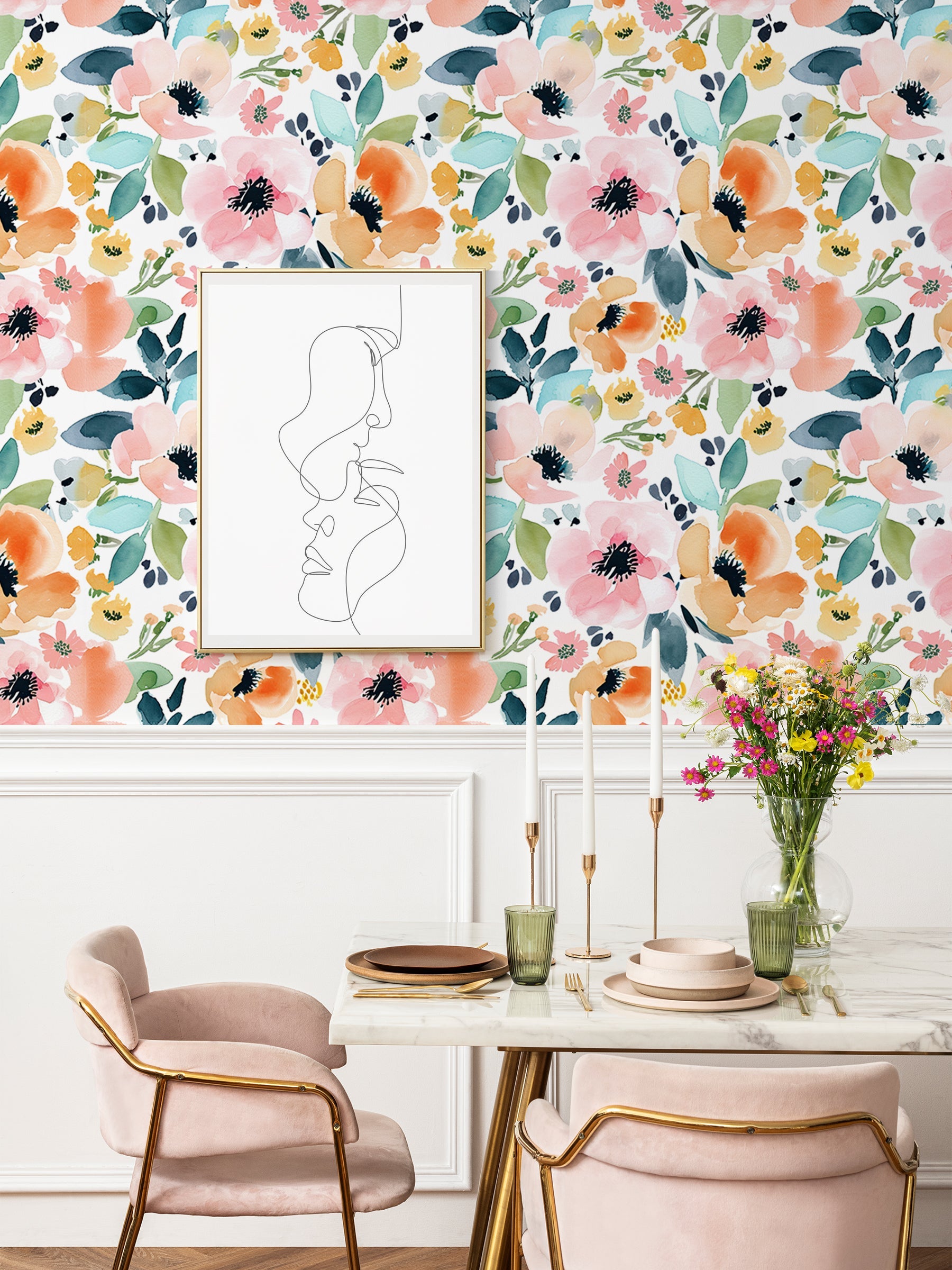
Bold Patterns: If your wallpaper screams with bold patterns—think large-scale flowers, intricate geometrics, or dramatic colors—the last thing you want is for your paint to shout too. Soft neutrals—whites, grays, muted taupes—will tone things down, giving the wallpaper room to breathe. The paint should play second fiddle. It’s the backdrop, not the star of the show.
-
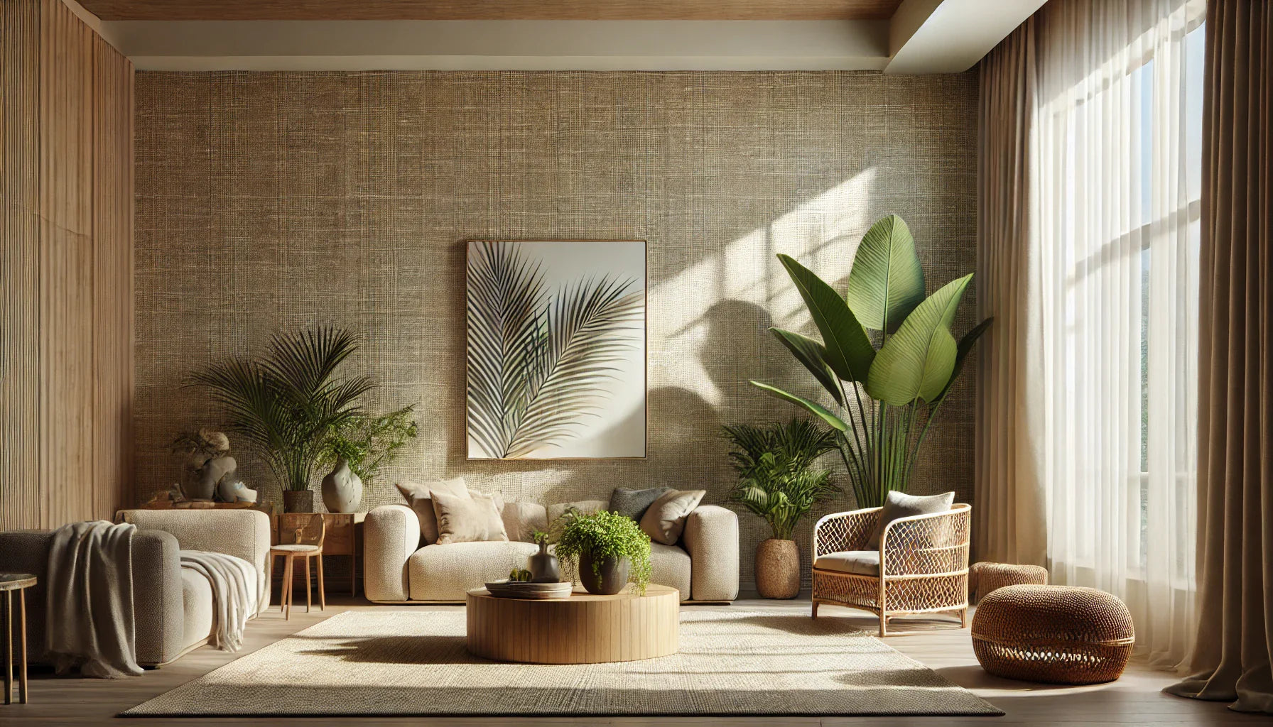
Subtle Patterns: If the wallpaper is quieter, with soft designs or delicate motifs, you have the freedom to experiment. Now’s your chance to let your paint sing. Deep navy, earthy terracotta, or even a rich mustard can bring new life to a more minimalist wallpaper. But remember, too much contrast can disrupt the flow. Balance is key.
Patterns, colors, textures—they all need to work in harmony. Don't just choose the first color you like. Think of it as composing a symphony—every element must contribute to the whole.
2. The Base Color—Your Guiding Light
Next, examine the wallpaper’s base color. The one that anchors everything. It’s the silent force that holds the design together. And it can help you make crucial decisions. You can either match it, complement it, or introduce a surprise element—but whatever you choose, make sure it doesn’t clash.
-
Light Base Colors: If your wallpaper is bathed in light—whites, creams, pastels—embrace soft, airy paints. Think gentle blues, cool grays, or even a muted lavender. These colors create a serene atmosphere, offering subtle contrast that lets the wallpaper breathe. The light base is like a blank canvas—tread lightly, or you’ll overpower it.
-
Dark Base Colors: When your wallpaper is grounded in a darker tone—navy, charcoal, or forest green—you’ll want to lift the room’s energy with light, warm tones. A soft off-white, a warm taupe, or a delicate peach can bring balance and contrast without undermining the wallpaper’s depth. Dark tones are cozy but can feel heavy, so lighten things up with a thoughtful paint choice.
Your wallpaper’s base color isn’t just a detail—it’s the foundation of your color story. It’ll guide you toward the right decision, helping you avoid color chaos.
3. Accent Colors—Small but Mighty
Now, let’s talk accents. These are the highlights of your wallpaper—small bursts of color that punctuate the design. If you want your paint to truly shine, consider these accents as a starting point. They're the details that can elevate the room.
-
Warm Accents: If your wallpaper has warm accents—think gold, copper, or a fiery red—use these hues to inspire your paint choice. A warm cream or a soft gold can bring these accents into the foreground, making them feel intentional, not out of place. This method creates a luxurious, cohesive feel.
-
Cool Accents: If your wallpaper is dancing with cool accents—blues, greens, purples—you can mirror these in your paint. But don’t feel boxed in. If your wallpaper has hints of pastel pink or lilac, a soft mint or pale gray can open up the space while still feeling connected.
Matching or complementing your wallpaper’s accent colors is an easy way to ensure your room feels cohesive. The magic lies in those little details. Think of the accents as the finishing touch, and build your paint around them.
4. Test First—Don’t Guess, Test!
You’ve narrowed down your options. Now, don’t rush to commit! Color on the wall is a whole different animal than what you see in a can. Lighting, room size, and furniture all play a role in how a color appears.
-
Swatch It! Grab some sample pots and paint large sections on the wall. Not just tiny dots. Large swatches. Trust me, this will save you heartache later. Watch how the color shifts with different lighting—early morning light, afternoon sunlight, and evening dimness.
-
Colors Shift: A shade that looks soft and sophisticated under artificial light might look garish in daylight. Testing is essential. It’s like dating before you marry—you need to know how the color behaves in your space.
It’s all about eliminating uncertainty. Testing takes time, yes, but it ensures you make a decision you’ll love long-term.
5. The Room’s Function—Purposeful Design Choices
Function follows form, right? Think about the room’s purpose. Is it a serene bedroom, a lively living room, or a vibrant kitchen? Paint, just like wallpaper, serves a purpose. Don’t just pick a color because it looks good. Pick it because it suits the space.
-
Living Rooms & Kitchens: These areas are often social hubs. The energy here should be high, but not overwhelming. Play with bold accents—think muted teal, deep plum, or warm mustard. They add depth and sophistication without making the space feel too serious. Kitchens, too, benefit from lively, inviting colors that make the space feel open and welcoming.
-
Bedrooms & Bathrooms: For private spaces, you’ll want something more subdued. Soft blues, gentle greens, or neutral tones that create a sense of peace. The paint color should support the calming atmosphere of the room, not steal the show.
6. The Finish—Matters More Than You Think
Let’s not forget the finish. The way your paint looks and feels when it catches the light can completely change the vibe of your room.
-
Glossy Finishes: Glossy paint reflects light, making a room feel bright and open. However, be mindful—high-gloss finishes highlight imperfections. Use them sparingly, and only in spaces where you don’t mind showcasing a bit of shine.
-
Matte Finishes: Matte paint absorbs light, offering a smooth, velvety texture that hides imperfections. It’s perfect for more textured wallpapers, giving them a soft, sophisticated backdrop. If your wallpaper has intricate designs, matte can help it stand out without feeling too busy.
Conclusion:
So, there you have it. Picking the right paint to match your wallpaper is an exercise in balance, creativity, and a touch of patience. Consider the pattern, base color, and accents. Test the shades. Think about the function of the room. And, most importantly, choose a finish that works with your wallpaper’s texture. The result? A space that feels effortless, yet thoughtfully designed.
Ready to find the perfect wallpaper to pair with your ideal paint color? Visit HaokHome Removable & Renter-Friendly Peel and Stick Wallpaper to explore our diverse collection of high-quality wallpapers, each designed to complement any room style. Need help choosing? Contact us for personalized design advice and tips!